Top 5 Alternatives to Comic Sans
Article by Studio Ground Floor
Five free, affordable or free-to-try alternatives to the well-memed classic, Comic Sans.

Comic Sans is one of the (if not the) most recognisable fonts in the world.
Inspired by comic book lettering, the rounded, non-connecting script was drawn originally by designer Vincent Connare in 1994 for Microsoft, designed with the earnest intention of offering the public a friendly, welcoming and – importantly – legible typeface to be freely used by the world over. In the quarter-century since its introduction, however, the sans serif has indeed… divided its critics. To some, beloved; to others, despised, Comic Sans initially found sincere usage within educational spaces due to its accessibility and friendliness, yet soon after became the well-memed, parodied and mocked household name it is now.
Considering all this history, as big font fans, we asked ourselves, is it really worth the hate? After all, it’s reported that its rounded design not only helps general retention of information, regardless of one’s neurodiversity, but its legibility actively improves the education of those with learning disabilities, such as dyslexia. But most of all, rounded fonts are fun! They can be super playful, or add that extra something to your very swiss design that you didn’t realise you needed; you can’t deny it. Who says fun can’t be cool?
With this in mind, we’ve got together five new alternatives to Comic Sans that embrace the ‘90s icon’s balance of practicality and playfulness. Praise be Comic Sans. It walked so rounded type could run!
GT Maru by Grilli Type
Offering a unique harmony between the human hand and machine, GT Maru from Swiss Type Foundry, Grilli Type, takes font-based fun to an entirely new level. Inspired by the rounded characters found in Japanese signage and the contrast to their stark Swiss counterparts, designer Thierry Blancpain set to combine the warmth and block-like construction of Japan’s brush-painted lettering with the mechanical quality of systemised letters, resulting in a prolific font family, stuffed with 25 styles, five weights in proportional and monospaced versions and two (yes two!) emoji fonts – making it even easier to express yourself.


Documan by Displaay
Initially drawn as a bespoke typeface for Charta 77 Foundation’s identity, Displaay’s semi-rounded sans serif, Documan, challenges the typewriter aesthetic of its inspiration by not actually being monospaced. Rife with playful tittles and alternate glyphs, the nine-weight, nine-style font has been continuously fine-tuned and updated over the last decade since its launch in 2013. Now, with its own entirely free to use ‘Stencil’ (STC) and decorative ‘Construct’ (CNT) cuts, Documan sets out to be a staple of the rounded sans genre, adding a wonderfully odd, unexpected extended family to the mix.


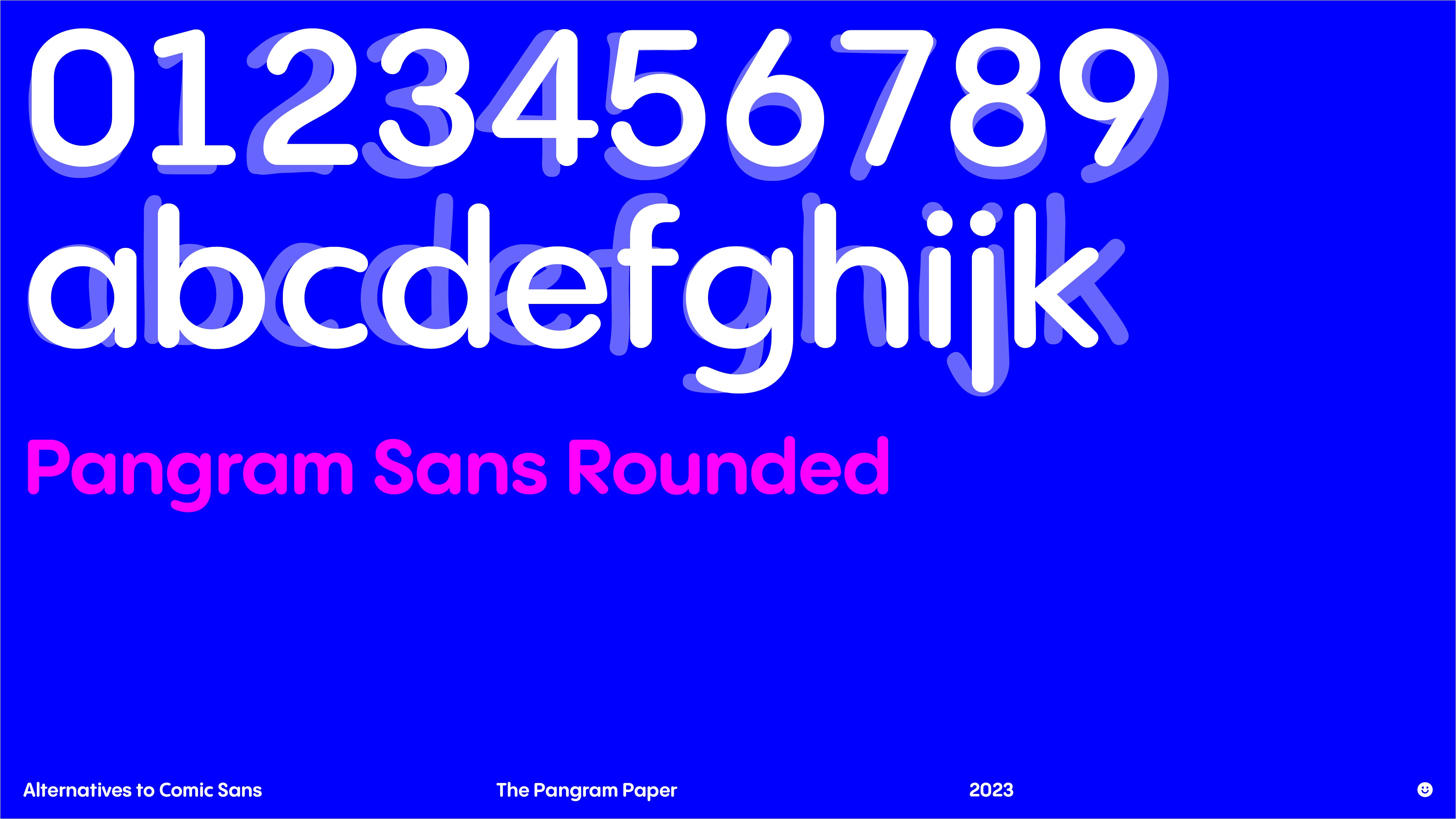
Pangram Sans Rounded by Pangram Pangram
If you’re a regular reader of The Pangram Paper, you’ll know that here at Studio Ground Floor, we’re BIG fans of Pangram Sans Rounded. Launched following the release of its angular counterpart, Pangram Sans, the friendly geometric font is as extensive a typographic workhorse as it is playful. With over 140 styles, Cyrillic support and distinctive uber-chunky weights, the typeface is a no-brainer for making any design more fun and functional. Also, the smiley face glyph is guaranteed to put a smile on your face on even the glummest of days.


G2 Kiamos by Gruppo Due
Gruppo Due’s latest monoline release, G2 Kosmos, is a mid-century geometric font for the modern day, championing a timeless, unapologetic, charming aesthetic – with enough typographic power to back up its visual strength. Drafted originally as part of Maxim Weirich’s diploma in 2019, G2 Kosmos’ foundational grid mirrors the system of Wolfgang Schmidt’s Lebenszeichen (“signs of life”), resulting in shapely, flowing letterforms that exude a profoundly personal, emotive tone. With the help of Gruppo Due, the rounded monoline is now available in a robust extended cut, as well as alternate characters that refer back to Schmidt’s original drawings.


Maax Rounded by 205TF
Elementary, effective and extremely welcoming, 205TF’s Maax Rounded, designed by Damien Gautier in 2012, earnestly offers a punchy, well-constructed font featuring three weights with corresponding italics. Due to the innately rounded terminals and construction of its non-rounded sans serif sibling, Maax, Maax Rounded forms a distinct, rhythmic design in use, succeeding in Comic San’s OG intentions – balancing play and practicality.


More ↓↓↓(Reading is good
for you)
More ↓↓↓(Reading is good
for you)


