You were forced asked to use Comic Sans? But you just can’t. Because … well … because of Comic Sans. You want something more sophisticated, less seen and better executed? These are my top suggestions, that come with a similar appeal, but less hated 😉.
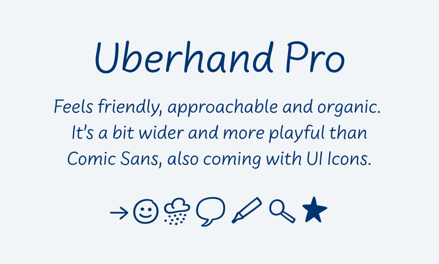
Uberhand Pro
Uberhand Pro was designed by Jens Kutilek, and a more advanced successor to his free alternative Comic Jens. It also comes with a handwritten appeal, is more sophisticated, has plenty of weights and also UI Icons, and is also available on Adobe Fonts.
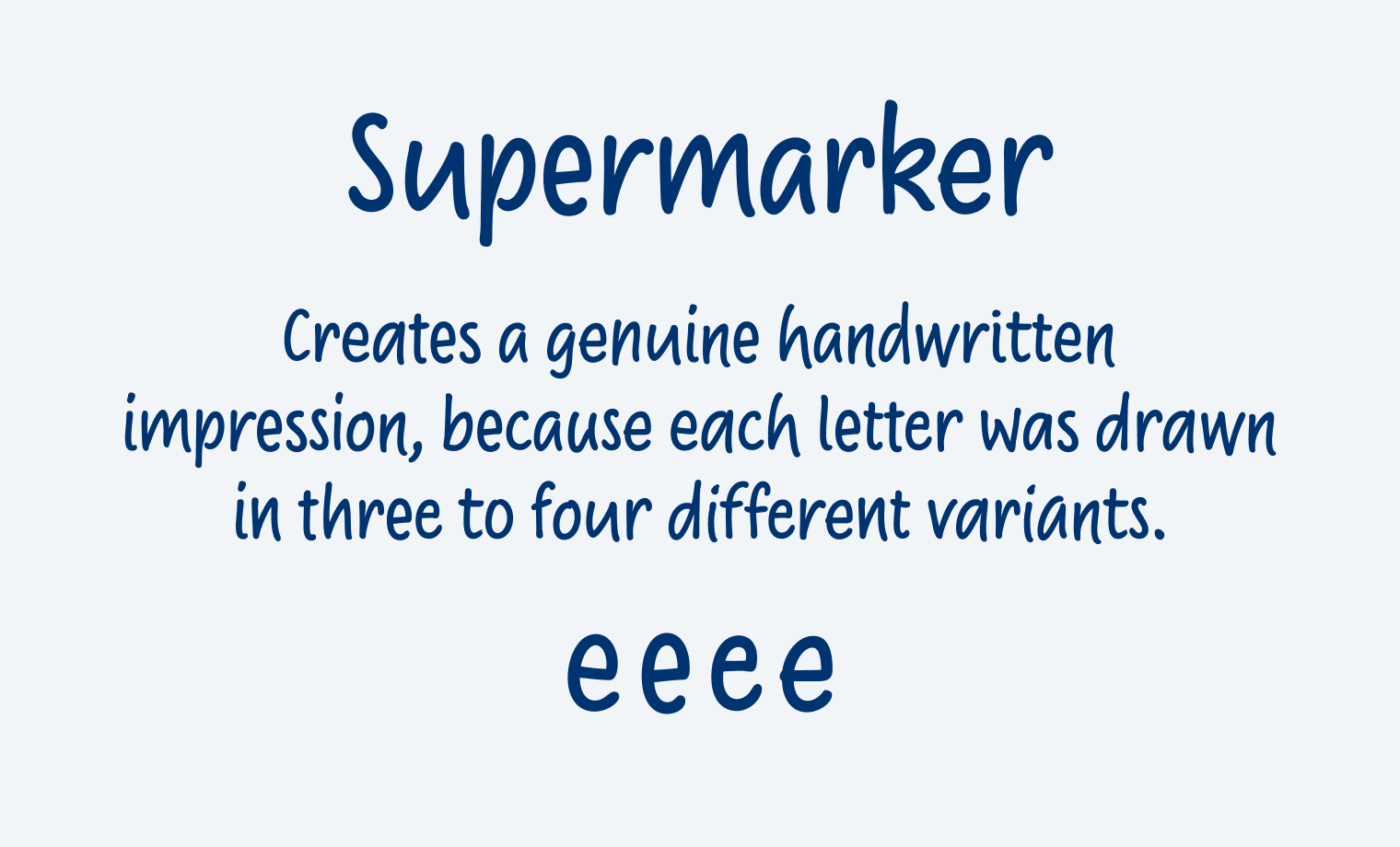
Supermarker
One of my most loved handwritten style typefaces. Supermarker, designed by Ulrike Rausch, is available from Fontwerk. I absolutely love the genuine handwritten impression it makes, due to the many alternative characters. I did a review about it here.
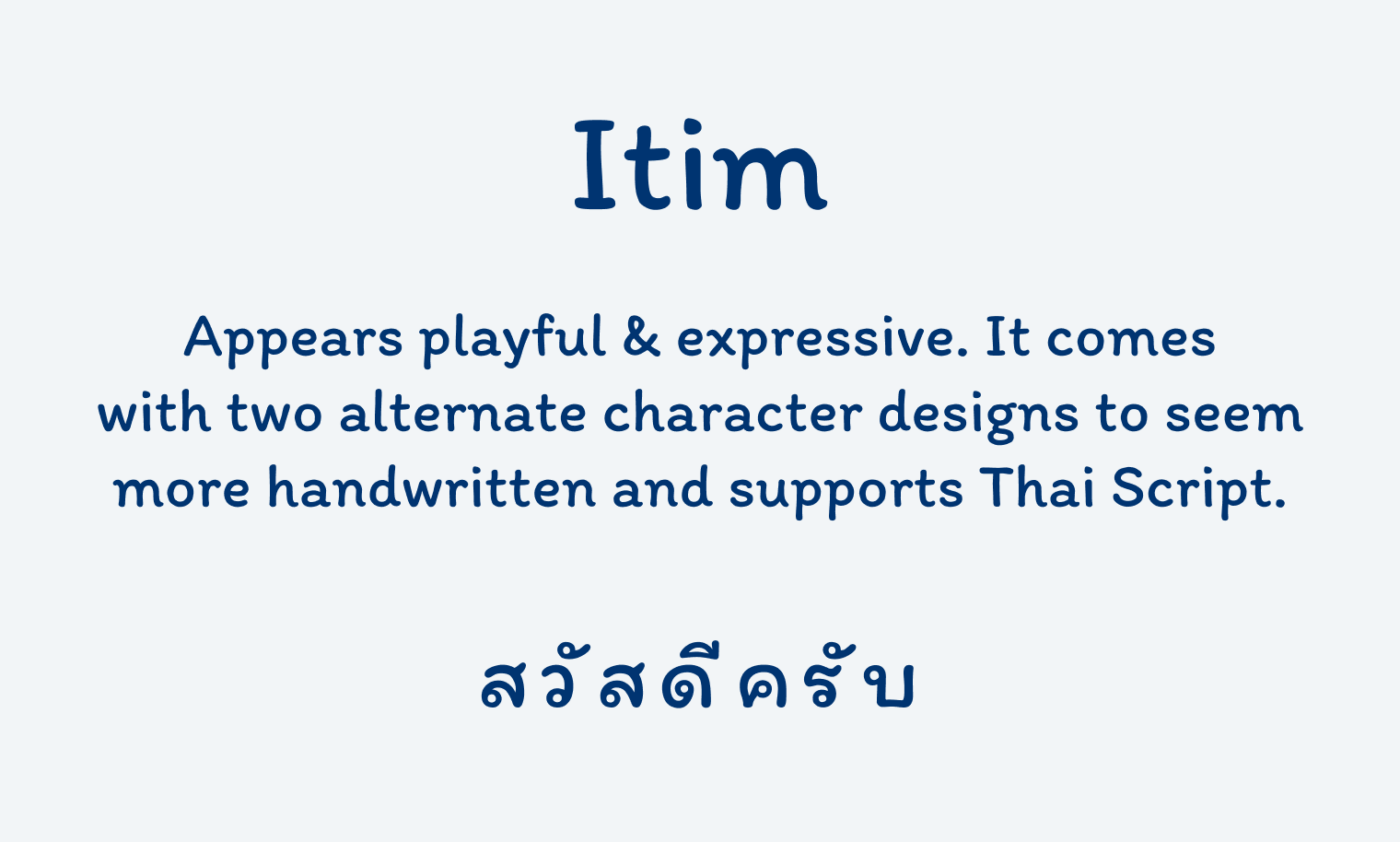
Itim (free font)
The free font Itim, designed by Cadson Demak, goes in a little different direction. It is more striking, also available on Google Fonts. It comes with only one weight, which is somehow semi-bold, and more suited for headings or larger text. Since it’s by a Thai foundry, it also covers Thai script.
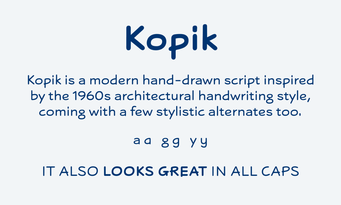
Kopik
I discovered this typeface in my Typodarium calendar and really like the simple marker pen vibe it conveys. Kopik, designed by Jonathan Hill from The Northern Block is a modern hand-drawn script inspired by the 1960s architectural handwriting style, creating a simple, readable, monolinear impression. The typeface is also available on Adobe Fonts.
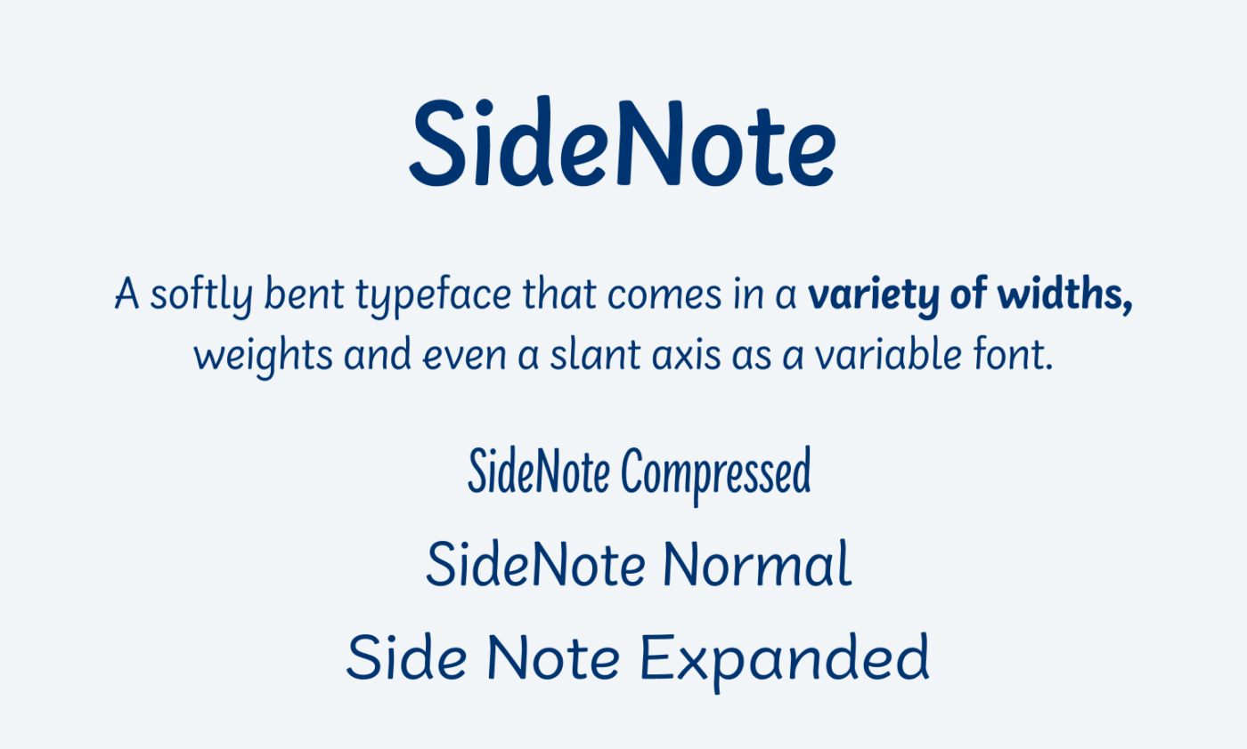
SideNote
SideNote by Borys Kosmynka and Jamie Clarke is super casual cool and versatile. Coming as a variable font with three axis, weight, width and slant. This gives you a lot of freedom to design with, and lets you adjust it to the space you have available. All while remaining a friendly and approachable vibe. Buy it here on I Love Typography (affiliate link), also available on Adobe Fonts as well. Thanks for pointing me towards this, Borys!
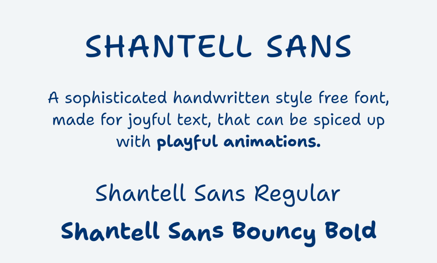
Shantell Sans (free font)
The sophisticated handwritten style free font Shantell Sans is based on the handwriting of the artist Shantell Martin. It is made for joyful text and can be spiced up with playful animations. Read my full review here. Available on Google Fonts.
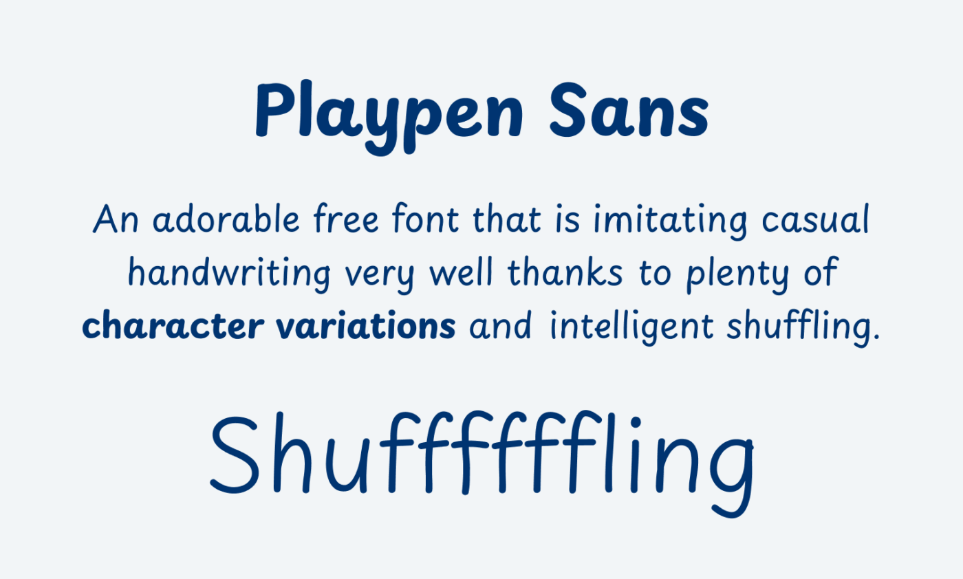
Playpen Sans (free font)
The approachable free typeface Playpen Sans immigrates handwriting very well and is a little calmer than Shantell Sans. It has plenty of character variations to create an authentic impression, and also comes with some adorable icons. Read my review here, Playpen Sans is also on Google Fonts.
What are your alternative to Comic Sans? Tell me in the comments below!
What do you think about supernett (https://www.facetype.org/?font=supernett) as an alternative to Comic Sans? I was lucky to purchase a license for the whole family in 2021 for 35 €.
Cool, did not know that, Ulrich! I think it makes a good first impression, but only with with OpenType Contextual Alternates activated. Otherwise it shows too little variety to live up to the expectation of really handwritten.
Hy Oliver! What a classic article about alternative fonts to Comic sans. I check the list of fonts you mention. I would try to use a few of these fonts in my upcoming projects.
That’s wonderful, Josh! Hope it will make your next project even better ☺️. For what kind of job are you planning to use it?