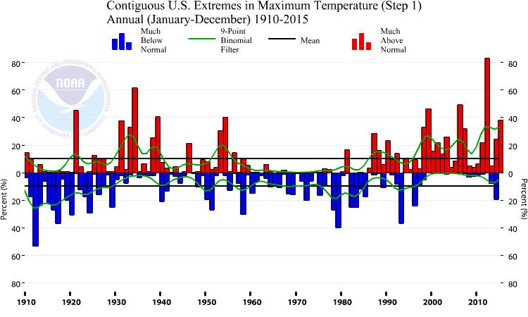
The graph shows extremes in maximum temperature in the contiguous United States on an annual basis (January through December) from 1910 to 2015, and was generated by the U.S. Climate Extremes Index graphing tool. Visit the tool to further explore data on extreme temperatures, precipitation, and other indicators.
Red bars mean the annual temperature was much above normal, while the blue bars indicate that annual temperatures were much below normal. Much above or below normal are defined as those falling in the upper or lower, as the case may be, tenth percentile of the local period of record.
Page/s that contain this image:
Last modified:
5 May 2016 - 4:08pm

