Last night, as I lay in a bath of gradually cooling water, like the inverse of how you’re supposed to cook a lobster, I thought, “this is a bit unusual.” That makes it sound like I’m going to get unnecessarily medical. Let me rephrase that. Last night, it occurred to me that lying in a pool of water, inside a house, is, in the grand scheme of things, a fairly recent development. The entire story of human civilization has been about trying to get out of the cold and wet and find somewhere warm and dry to set up a nest. But as our nests got more advanced we realised that a bit of water, in specific circumstances, would be quite handy. And so plumbing was invented.
Plumbing is something that equally impresses and baffles me. If I had to work out from scratch how to ensure that every house in the country has a series of pipes that supply fresh, clean water to the inhabitants, I wouldn’t have a clue where to start. Even the plumbing just in my own house baffles me. Give me a few cardboard boxes and some rolls of coloured vinyl sheeting and I know I can make, for instance, a reasonably impressive Optimus Prime costume. But ask me to fix a plumbing problem and I will return with a confused and disgruntled (and probably damp) face. There’s a sort of puddle that appears on one of my kitchen work surfaces every now and again, somewhere near the boiler, I think. Anyway, sometimes the puddle’s there, and sometimes it’s not. I haven’t a clue what to do about it, or even if I could do anything about it. I think I’m resigned to letting it get on with doing its own thing, sort of like the weather.
As my bath got cooler, I started to wonder what the world would be like if everyone was as clueless as I am with water. What if, for instance, one day large numbers of people decided that proper plumbing was all very well and good, but actually, what might be really quite snazzy would be an irreverent twist on the boring, stuffy tradition of pipes and valves and things. Brightly coloured drinking straws might be fun. Imagine if people started ripping out all the pipes in their houses and cobbling together a ramshackle system of drinking straws instead. As established, I am not a plumbing expert, but I reckon the results would be pretty horrendous.
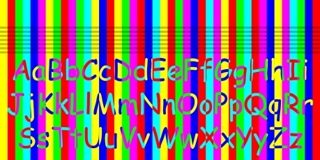
Something similar has happened typographically in the last 20 years or so. Instead of people deciding to use drinking straws for plumbing, people have decided to use the font Comic Sans in all sorts of odd contexts for which it isn’t suitable.
In 1930, the typographical scholar Beatrice Warde made a speech in which she suggested good type should be clear and refined like a crystal goblet holding fine wine. Using Comic Sans is like sticking a cheap plastic drinking straw into that crystal goblet. Like a brightly coloured drinking straw, it’s best suited for children’s parties, and best avoided for almost everything else. In other words, using Comic Sans sucks.
To understand just why that is, we need to look at why Comic Sans was originally created. In the early 1990s Microsoft were developing a new piece of software called Bob. The intention was to create an interface that would make using a computer an easier, friendlier experience. Central to this was a yellow cartoon dog called Rover who spoke to the user through comic-style speech bubbles. In 1994, Vincent Connare, employed by Microsoft as a “typographic engineer”, noticed that Rover’s speech bubbles used Times New Roman, a formal and slightly authoritarian serif font. He realised that a more fun, loose, friendly font was needed and started work on what would become Comic Sans. In the end, Bob was released without Comic Sans, and flopped. But Comic Sans lived on. It started to be used in other Microsoft products. It was included in Windows operating systems. Comic Sans had escaped. The font that was only ever supposed to be the fun, childlike, informal voice of a little yellow cartoon dog started to be used in various inappropriate contexts.
Nothing typed in Comic Sans will ever look serious or authoritative, sensible or grown-up. Because of the way the letters have been designed, it can only look sloppy, ill-considered, quickly rendered and childish. It’s easy to sneer when Comic Sans is used, because it is, in almost all cases, such a bad choice of font. I think that in these cases people are just looking for something different to (what they think are) all the other boring, staid, smart fonts. Maybe designers, safely ensconced in ivory towers, looking down at the uneducated public and sneering, have brought the Comic Sans revolution on themselves. Most people don’t understand how something as apparently simple as the choice of a font can inspire such revulsion and hatred within a supposedly sensible human being. If typographers could do a better job at communicating and educating people about the beauty of typography, and exactly why bad fonts and font choices are bad, everyone could start to see why there are much more appropriate fonts than Comic Sans. And maybe then it can finally go back to only having that single application as the voice of a little yellow cartoon dog called Rover.


