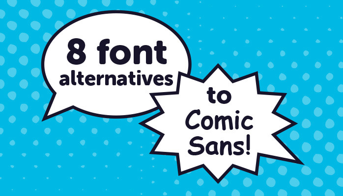
Eight font alternatives to Comic Sans
Also known as, ‘Comic Sans … it’s not a funny font, so stop annoying designers’
Comic Sans, the constant favourite of school notice boards, charity newsletters and office dishwasher notices. As a designer, Comic Sans is obviously not a favourite of mine. To me, there’s only two places it can be used successfully … in the speech bubbles of an actual comic, or in a pastiche of Roy Lichtenstein’s fantastic pop art images (essentially, takes on comic book imagery themselves).
I blame computer operating systems for its continued use elsewhere. In their desperate search for ‘something fun’, businesses with no budget for further font purchases turn to the lowly system fonts on their computers. When looking for something in between a serif (think Times New Roman) and a sans serif (think Arial), there’s little to smack them between the eyes, apart from Comic Sans, with its squirty plastic flower and ridiculous shoes. So, regrettably it’s become the ‘go-to’ font of choice when something needs to be a little bit quirky or different.
As a bid to lessen the increasing spread of the Comic Sans epidemic, I thought it would be useful to detail eight alternatives. These alternatives can all be found on Google Fonts, accessed via your PC or Apple Mac, and even used on your website – for free! Comic Sans is packing his bags already.
In running through these eight alternatives, I’ll start with a couple of more sedate, sans-serif fonts, suitable for everyday use. After that, I’ll work up to a couple that should probably only be used for shorter display statements or headlines, rather than full body-copy. The four in between can be used in both circumstances.
Suggested font alternatives:
Open Sans
“Open Sans is a humanist sans serif typeface designed by Steve Matteson, Type Director of Ascender Corp. Open Sans was designed with an upright stress, open forms and a neutral, yet friendly appearance. It was optimised for print, web, and mobile interfaces, and has excellent legibility characteristics.”
Open Sans comes in five different weights as well as italic versions for each weight – plenty of scope for that school newsletter!

Lato
“Lato is a sans serif typeface family started in the summer of 2010 by Warsaw-based designer Łukasz Dziedzic (“Lato” means “Summer” in Polish). The semi-rounded details of the letters give Lato a feeling of warmth, while the strong structure provides stability and seriousness. “Male and female, serious but friendly. With the feeling of the Summer,” says Łukasz.”
There are five weights of Lato – Thin, Light, Regular, Bold, and Black. There are also italic versions of each of these weights.

Ubuntu
The final font files and the design files used to produce the font family are distributed under an open licence. The typeface is sans-serif, uses OpenType features and is manually hinted for clarity on desktop and mobile computing screens. The technical font design work is being undertaken by international typeface design group Dalton Maag.
Four weights of Ubuntu, as well as italics give it plenty of flexibility, both for print and website design.

Asap
“Asap is a contemporary sans-serif family with subtle rounded corners. Developed by Pablo Cosgaya, Asap (‘as soon as possible’) was specially developed with a shared character width for each glyph across each style, so that lines of text in a paragraph always have the same length. This useful feature allows you to change styles without seeing any text reflow.”
Asap is only available in two weights, as well as italic versions. This means it’s best to limit use of this font to larger headlines and subheadings. Try pairing with a clean sans serif such as Open Sans for longer body copy.

Varela Round
“Varela Round is based on the well known font Varela. Its rounded corners make it perfect for a soft feel and work great at any size. It is suitable for headlines and printed collateral, and maintains its distinct properties amongst other objects. Varela Round is a great font for any website.”
Whilst only available in this one weight, it actually works really well, both as a headline font and in longer body copy. It just doesn’t give you the option to pull anything out in bold or italic.

Quicksand
A display sans serif with rounded ends, available in three weights. The typeface was designed by Andrew Paglinawan. Probably better for use in headlines and subheadings rather than long body copy. Try pairing with a simpler body copy font such as Lato (see above), Roboto or Oswald (all Google fonts).
Available in the three weights of Light, Regular and Bold, but no italic versions.

Dosis
Dosis is another rounded sans-serif typeface. Designed by Edgar Tolentino and Pablo Impallari, it is slightly condensed in nature and available in seven different weights, ranging from Extra-Light through to Extra-Bold.

Comfortaa
Comfortaa is a rounded, geometric, sans-serif typeface family intended for use at large sizes. Designed by Johan Aakerlund. Available in three weights, it’s best used restricted to larger headings and subheadings. You could always pair it with a body copy font that has subtle rounded elements such as Lato.

In conclusion
There’s plenty of choice out there nowadays in terms of free fonts – especially with the introduction of Google fonts. So, let’s wave goodbye to Comic Sans, unless you’re producing an actual comic. In which case, stick it in a speech bubble and carry on. The eight examples above cover only the tip of the font iceberg on Google. At the time of writing this post, there were 804 different fonts available and the collection is being added to on a regular basis.
Find this useful and interesting? Please share it with others who you think might find it useful.
Originally from a post on the Creative Cadence blog
Mentoring for Small Business Owners┃Prince's Trust Business Mentor ┃Climate activist 🌍
7yI have used Ubuntu before so interested to see it made your list Christian.