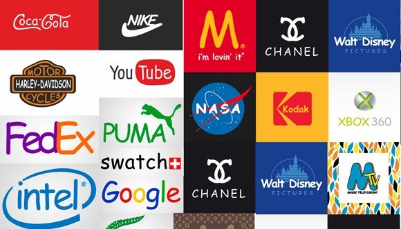
Font of the Day: Comic Sans MS
Font of the Day: A curiously benign and controversial font, Comic Sans MS, commonly referred to as Comic Sans, is a sans-serif casual script typeface designed by Vincent Connare and released in 1994 by Microsoft Corporation. It is a casual, non-connecting script inspired by comic book lettering, intended for use in informal documents and educational materials.
The typeface has been supplied with Microsoft Windows since the introduction of Windows 95, initially as a supplemental font in the Windows Plus Pack and later in Microsoft Comic Chat. Describing it, Microsoft has explained that "this casual but legible face has proved very popular with a wide variety of people."
The typeface's widespread use, often in situations for which it was not intended, has been criticized.
Installed on the majority of computers worldwide, Comic Sans sees widespread use. Within four years of its release on Windows, designers had begun to argue that it had become overused, often through use in serious and formal documents in which it could appear too informal or even as inappropriate and disrespectful. Examples of uses to which it has been considered poorly suited have been a Dutch war memorial, printed advice for rape victims, blog posts by a law firm and as a font recommended for résumés in careers training.
The font is nonetheless very popular with educational users, up to university level, with many schools requiring it in their style guides. Some have even imposed monitoring to make sure that it is used enough as part of their good teaching checklists.
Opposition
The Boston Phoenix reported on disgruntlement over the widespread use of the font, especially its incongruous use for writing on serious subjects, with the complaints urged on by a campaign started by two Indianapolis graphic designers, Dave and Holly Combs, via their website "Ban Comic Sans". The movement was conceived in 1999 by the two designers, after an employer insisted that one of them use Comic Sans in a children's museum exhibit, and in early 2009, the movement was "stronger now than ever".The web site's main argument is that a typeface should match the tone of its text, and that the irreverence of Comic Sans is often at odds with a serious message, such as a "do not enter" sign.
In the 2005 session of the youth model parliament in Ontario, the New Democratic Party included the clause "Ban the font known as Comic Sans" in an omnibus ban bill.
Comic book artist Dave Gibbons, whose work was one of the inspirations for the font, said that it was "a shame they couldn't have used just the original font, because [Comic Sans] is a real mess. I think it's a particularly ugly letter form."
Film producer and New York Times essayist Errol Morris wrote in an August 2012 posting, "The conscious awareness of Comic Sans promotes — at least among some people — contempt and summary dismissal." With the help of a professor, he conducted an online experiment and found that Comic Sans, in comparison with five other fonts (Baskerville, Helvetica, Georgia, Trebuchet MS, and Computer Modern), makes readers slightly less likely to believe that a statement they are reading is true.
Commenting on its critics, Connare said they should "get another hobby."In the Netherlands popular radio DJs Coen Swijnenberg and Sander Lantinga decided to celebrate the font by having a Comic Sans day on the first Friday of July. Comic Sans Day has been held since 2009. Some Dutch companies have their website in Comic Sans on this day.
Font expert Stephen Coles defended its use, commenting that it has "a monopoly on informality" among common computer fonts, noting that among them "only one can be universally described as 'casual', 'fun', 'playful'.[29] He nonetheless recommended that designers seek out alternative professional fonts in the same style for variety.