
#BrandVolution: the evolution of the Pepsi logo
Some logos have remained pretty much the same over the years, while others have changed so much as to be almost unrecognisable from the original. An example? Pepsi. Over time, its visual identity has gradually diverged from that of its great rival, Coca-Cola, as it has sought to carve out a distinct identity of its own. In this article, we’ll look at the major milestones in this evolution.
Pepsi: a brief history of the brand (and the name)
The Pepsi story began in 1898 when Caleb Bradham, a pharmacist from New Bern, North Carolina, created a refreshing, cola-based drink. And so “Brad’s Drink” was born, named after its inventor, and only later rebaptised “Pepsi Cola”. The first part of the name is derived from the term “eupepsia”, which means “good digestion”, and emphasises the product’s properties, while “Cola” of course points to the beverage’s main ingredient.
In no time, Caleb Bradham ramped up production and, in 1903, founded the Pepsi Cola Company, investing heavily in advertising to promote the brand across the United States. The product’s key selling point? The price, which was significantly lower than the competition. During the Great Depression of the interwar period, this strategy enabled the company to go toe to toe with its biggest competitor, Coca-Cola, carving out a sizable chunk of the market for itself. From this point onwards, the battle between the two rivals would be relentless: Coca-Cola consolidated its identity, while Pepsi would move ever further away from its main rival by focusing on its personality and image. Let’s see how.
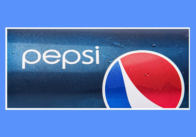
How the Pepsi logo has evolved from 1898 to today
Forget the iconic circle and signature colours of red, blue and white: the very first Pepsi logo simply comprised the words “Pepsi Cola” in red lettering. The contorted typeface used was by no means memorable nor easy to read. Notice any similarities with the Coca-Cola label?
That similarity became even more evident after the 1905 makeover. Look at the swash emerging from the letter “C” of Cola: comparisons between the two logos are unavoidable. Apart from this, the letters become fatter, bolder and easier to read. But Pepsi’s identity was still not felt: the company was too busy copying its competitor.
Now we fast forward to the Second World War, because it was then that the logo underwent a major change: at this delicate moment in history, Pepsi decided to show its support for the United States by adopting the colours of the Stars and Stripes. Colours that would become part of its DNA.
As the brand’s authority and self-confidence grew, so did the desire to differentiate itself from Coca-Cola by establishing a clear identity of its own. And so, in 1962, the Pepsi logo had a complete overhaul: the word Cola disappeared for good; the typeface became a recognisable, easy-to-read sans-serif; a bottle top was incorporated into the logo; and the colours were split into three wavy bands, creating a dynamic effect.
Redesign after redesign, the bottle top became more and more two-dimensional until it ended up stylised as a circle. The logo here is the “boxed” version from 1971.
In 1991, the logo broke out of the rectangle and the font was tilted slightly as if it were moving, giving a sense of dynamism. The globe appeared in the bottom right, and no longer served as the background for the logo.
This is when the Pepsi Globe began its inexorable rise to become the brand’s iconic symbol. In 2003, the lettering “Pepsi” disappeared to leave just a sphere that has a realistic shadow (which accentuates the three-dimensional effect) and is covered in water droplets conveying the idea of coolness. Here it is in all its early noughties glory.
The year 2008 saw the last major redesign of the logo. The globe, now rotated to create a moving effect, is flat. The central white band opens to suggest a smile: it’s a way of associating the brand with a positive emotion, of conveying joy. The typeface is light, with thin and rounded strokes that echo the circular shape of the globe. There’s also a homage to the logo it once was: look carefully at the letter “e” and you’ll notice a little undulation, which is a nod to the old bottle top – precursor to the current globe. Here it is.
The Arnell Group, the design agency commissioned to create the new logo, explains its origins and meaning in this document. Check it out if you want to dive deeper into this story.